Problem
Previous research showed that users struggled to find the information they needed to evaluate Twilio’s products and rarely discovered additional, relevant content. The existing navigation was difficult to update, limiting the team's ability to test change, scale and iterate. With plans to consolidate content from SendGrid.com and Segment.com into Twilio.com, the web team needed a scalable, user-friendly navigation system.
Solution
I began by reviewing existing research and analytics on navigation behavior, while the content team audited pages across Twilio, SendGrid, and Segment. The goal was to identify high-value content worth keeping based on traffic, conversion data, and business priorities.
Once we finalized the list of pages, I conducted an unmoderated card sort to understand how users naturally grouped high-priority content. Based on the results, I created an initial draft of the information architecture, including the top navigation, sub navigation, and footer. Notable changes included separating authentication products from communication products, and expanding the "Developers" section into a broader "Resources" category.
I then led a review workshop with stakeholders from product marketing, SEO, content, the developer network, and the web team. Together, we refined the structure to meet both user needs and business goals. One major change was restructuring the "Why Twilio" menu to better align with Twilio’s core value propositions.
After internal alignment, I ran an unmoderated tree test to validate the new structure. Participants were able to locate nearly all of the tested links with ease. Only two links caused confusion. In those cases, no clear alternative placement emerged, so we opted to add contextual in-page links to support discovery.
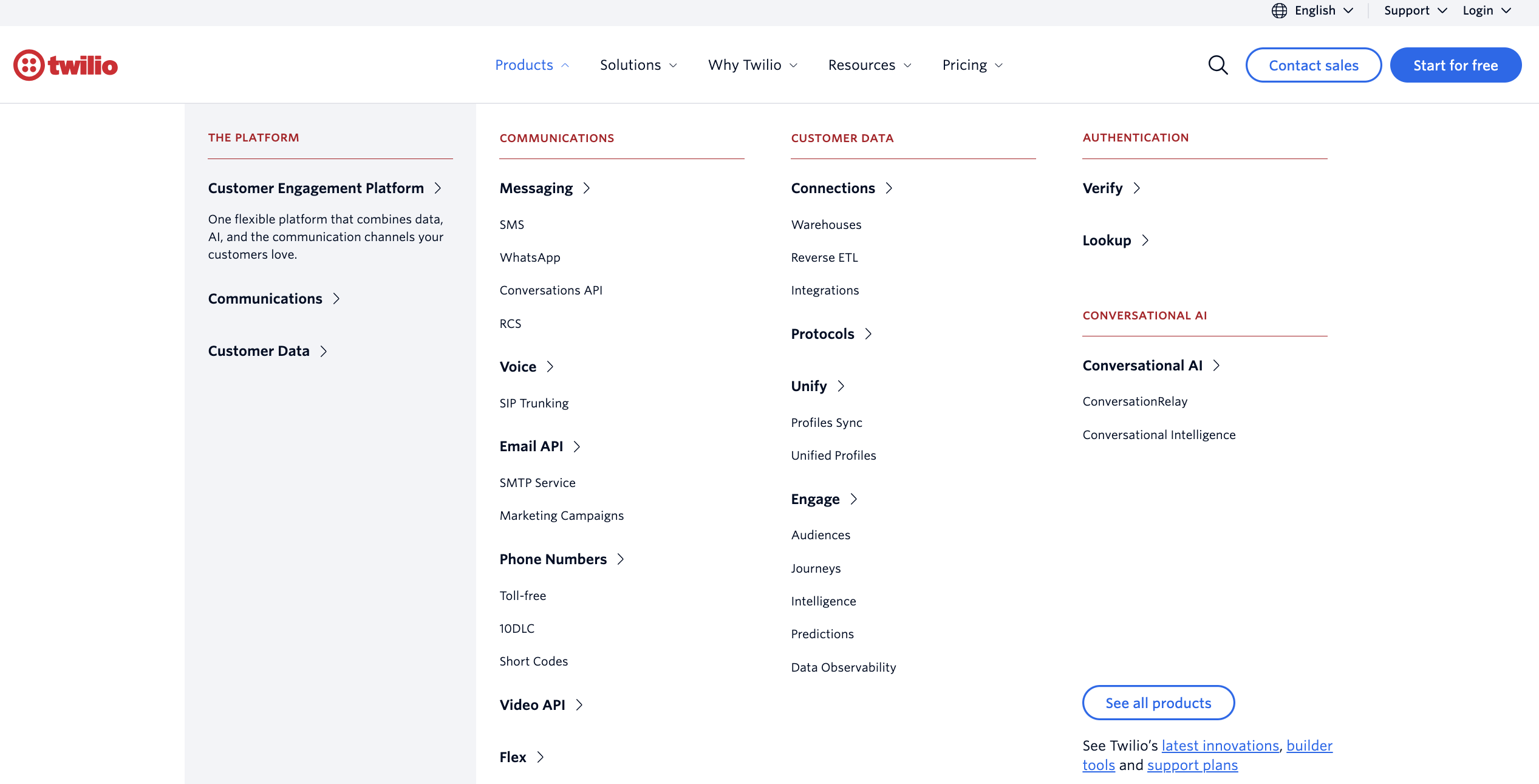
Next, I partnered with a brand designer to explore layout options and rapidly prototype using AI. Through unmoderated usability testing, we found that the previous link structure for secondary, sub links confused users. Instead, presenting these links in a visible list format improved scannability, clarified hierarchy, and boosted overall comprehension.
With the navigation components finalized, we used the same components to layout the footer I documented detailed specs for each component to support a smooth engineering handoff and assisted with QA before launch.
Results
In testing we found that the new navigation improved link findability for key links by 10% and sped up time to find links by 15 seconds on average.
The navigation update also removed the dependency on engineering to make updates to the navigation, saving engineering time and allowing the team to quickly test and iterate in order to better serve user needs.
- 10% improvement in users successfully finding key links during testing
- 15-second reduction in average time to locate key links
- Increased flexibility for the web team, with navigation updates no longer dependent on engineering—enabling faster iteration and more responsive user support